
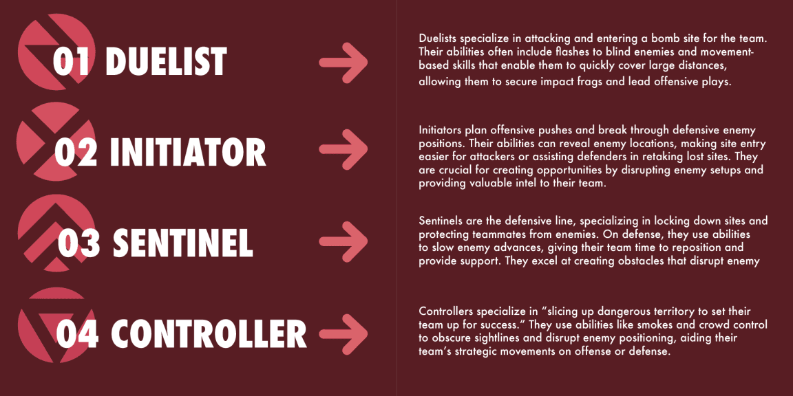
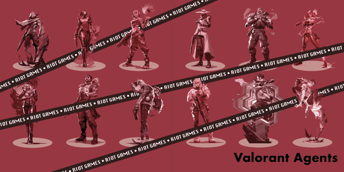
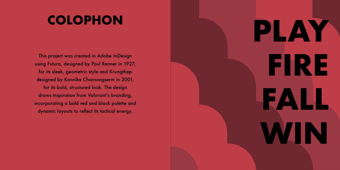
For my Typographic Systems I course, I designed a 16-page printed booklet using content sourced from Valorant’s Wikipedia page, reinterpreting it through the lens of typographic hierarchy and brand aesthetics. Inspired by Riot Games’ distinct visual identity for Valorant, I crafted layouts that balanced readability with dynamic composition. The project emphasized exploring type-driven systems while aligning with the game’s futuristic, tactical branding.
Timeline
November 2024 - December 2024
Analyzing the wiki page
VALORANT BRAND BOOK


This project taught me the importance of visual storytelling in reinforcing brand identity through typography. By focusing on layout, hierarchy, and type-based composition, I designed a booklet that not only informs but also captures the energy and tactical aesthetic of Valorant. It reinforced the value of blending aesthetics with function; using typography as a tool to create a more immersive and engaging experience that aligns with the game’s branding.
Other Projects
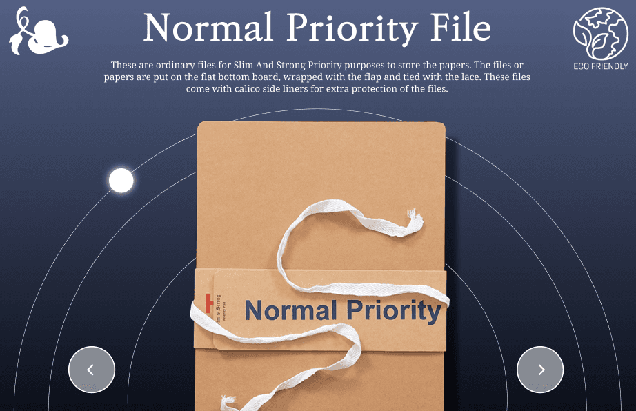
Priority Files
UI
A project creating a modern and engaging system for showcasing Tulasi Files' Priority Files.
Read More

Spectrum Magazine
Graphic Design
Work on magazine layouts, social media, and issue curation, with published artwork.
Read More

Ponder
UI/UX
An app concept for personalized journaling, life planning, and financial tracking.
Read More